
The Ultimate Guide to Choosing the Right Color Palette for Every Room
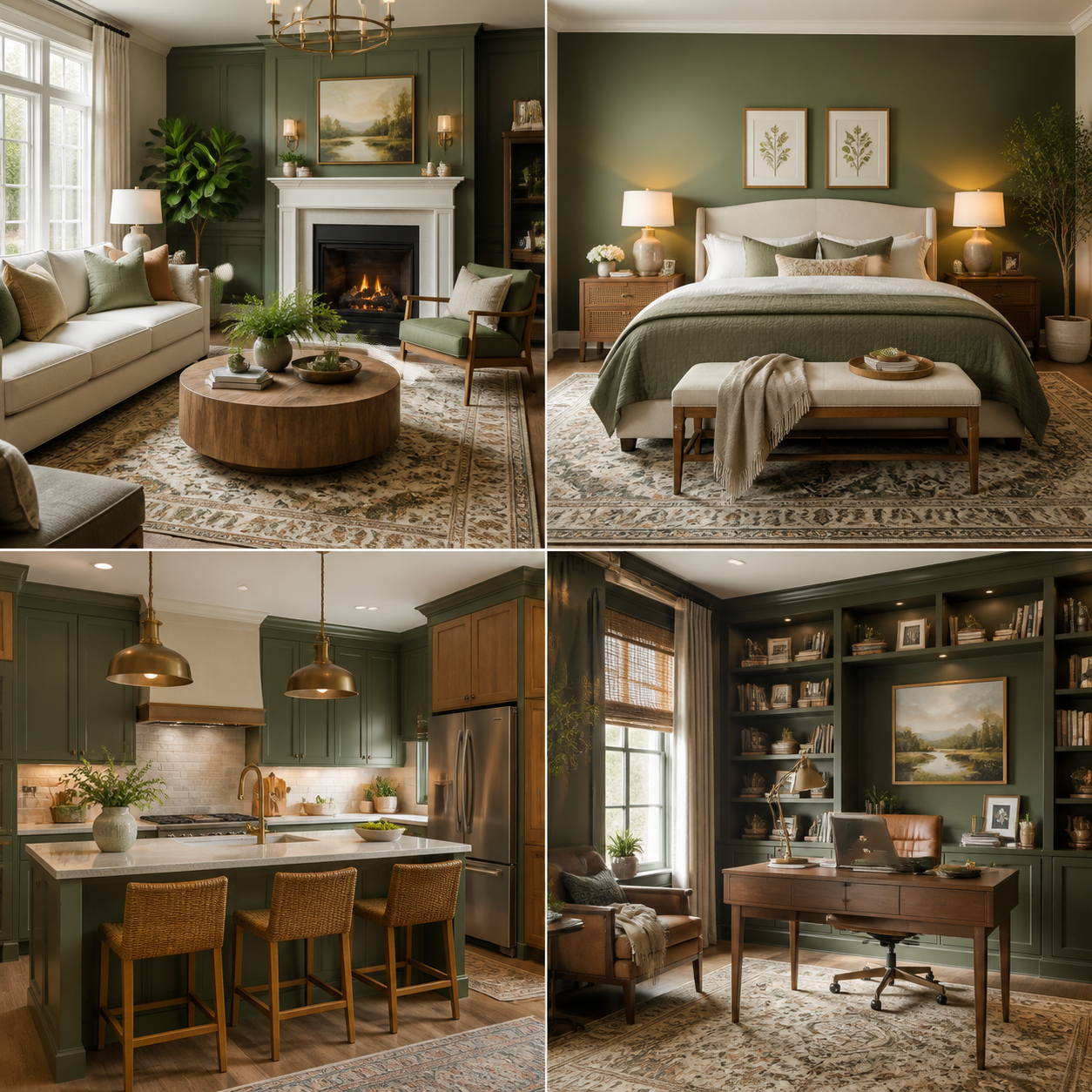
Choosing a home color palette becomes easier when you treat color as part of the whole room rather than an isolated paint decision. The right combination should suit the room’s function, work with natural and artificial lighting, complement existing furniture and flooring, and still feel connected to the rest of the house.
You do not need a design degree or an expensive consultation. With a color wheel, a few paint samples, and a simple planning method, you can create rooms that feel personal without looking visually disconnected.
Start With the Room’s Function and Mood
The best color palette starts with a room’s function and desired mood. Choose colors that support how you use the space, then adjust them for its size, light, architecture, and your personal preferences.
Begin by describing the feeling you want in three words. A living room might be relaxed, warm, and welcoming. A bedroom could be quiet, soft, and restful. A home office may need to feel focused, bright, and organized. These words give you a useful filter when you compare paint chips and fabrics.
Room size also affects the result. Pale colors generally reflect more light and can make a compact room feel more open, while deeper colors add visual weight and intimacy. That does not mean small rooms must always be white. A muted blue, warm clay, or soft green can work beautifully when the color is balanced with light furnishings and good illumination.
Consider fixed features before selecting a shade. Wood floors, stone countertops, exposed brick, tile, rugs, and large pieces of furniture often remain in place longer than paint. Your palette should respond to these elements rather than compete with them.
Understand the Basics of Color Theory
Color theory helps you combine shades with intention. The color wheel shows relationships between hues, while warm, cool, neutral, complementary, and analogous colors provide practical starting points for a DIY palette.
Warm colors such as red, orange, yellow, and many earthy tones can make a room feel energetic or cozy. Cool colors, including blue, green, and violet, often create a calmer impression. The effect depends on saturation, brightness, lighting, and surrounding materials, so color psychology should guide your choices rather than dictate them.
A neutral color palette uses shades such as white, cream, beige, gray, taupe, greige, and charcoal as its foundation. Neutrals are flexible, but they still have undertones. A gray with blue undertones may feel crisp beside white but cold beside cool daylight. A beige with pink or yellow undertones can look noticeably warmer.
Analogous colors sit next to each other on the color wheel, such as blue, blue-green, and green. They create a gentle, low-contrast scheme. Complementary colors sit opposite each other, such as blue and orange or green and red. Used in softened versions, they add energy without requiring bright primary colors everywhere.
For a straightforward balance, use the 60-30-10 decorating rule: approximately 60% of the room is the dominant color, 30% is a secondary color, and 10% is an accent color. Walls may provide the 60%, furniture and textiles the 30%, and artwork, cushions, or accessories the 10%.
Build a Cohesive Whole-Home Color Palette
A cohesive whole-home palette uses a repeating foundation, related supporting shades, and selective accent colors. Each room can have its own personality while sharing visual connections with nearby spaces.
Start with one foundational color family for circulation areas or several connected rooms. This might be warm white, pale greige, muted beige, or a soft gray-green. You can use the exact shade throughout the home or select closely related versions with the same undertone.
Next, choose two or three supporting colors. A useful framework is base, bridge, and spark:
- Base: the dependable neutral or dominant shade used on walls, large upholstery, or major surfaces.
- Bridge: a color repeated across rooms through rugs, curtains, cabinetry, artwork, or smaller furniture.
- Spark: an accent color used in limited quantities to create contrast and personality.
For example, a warm white base can connect to muted sage in the kitchen and bedroom, while terracotta serves as the accent in cushions, ceramics, and artwork. The rooms will not look identical, but the repeated undertones and accessories will make the home feel intentional.
Open-plan homes need especially careful transitions. View adjoining walls, flooring, and furniture together before choosing a strong color. In a home with separate rooms, you can take bigger risks, but repeat at least one visual thread, such as the same wood tone, accent color, or neutral undertone.
Choose Colors Room by Room
Room-specific color choices should reflect daily use, light conditions, and the atmosphere you want to create. Use the following ideas as adaptable starting points rather than strict rules.
Living room
Living rooms benefit from flexible colors because they often serve several purposes. Soft greige, warm white, muted olive, dusty blue, and light clay can support both relaxation and entertaining. If your sofa or rug has a strong pattern, choose a quieter wall color and repeat one of the pattern’s shades in accessories.
Bedroom
Bedrooms usually work well with low- to medium-saturation colors that feel restful. Consider blue-gray, sage, mushroom, lavender-gray, or a warm sand tone. A darker wall behind the headboard can create depth, but check the room’s natural light first. In a dim bedroom, a very cool navy may feel heavier than expected.
Kitchen
Kitchens need to feel clean while still connecting with practical finishes. Soft white, creamy beige, pale green, and blue-gray pair well with wood, stone, and painted cabinetry. If countertops have strong veining, sample wall colors beside them. A neutral wall may be the best choice when the backsplash already provides substantial pattern.
Bathroom
Bathrooms can handle fresh, reflective shades, including warm white, pale aqua, soft eucalyptus, and light gray. Natural stone often contains subtle beige, green, or blue undertones that should guide the paint selection. In a small bathroom, painting the ceiling a closely related light shade can make the space feel more continuous.
Dining area
Dining rooms are a good place for richer color because they are often used for shorter periods. Deep green, muted rust, charcoal blue, and warm ochre can create an intimate setting. Balance a dramatic wall with lighter table linens, reflective lighting, or pale wood.
Home office
Choose an office palette that supports concentration without making the room feel sterile. Blue-green, softened teal, warm gray, or muted olive can provide visual interest while remaining calm. Avoid placing a highly saturated accent directly behind a video-call position if it creates glare or distraction.
Coordinate Paint With Furniture, Flooring, and Lighting
Paint color changes according to surrounding finishes and lighting. Compare every candidate shade with furniture, flooring, textiles, metal finishes, and both daylight and artificial light before making a decision.
Natural light varies by direction. North-facing rooms often receive cooler, softer light, which can emphasize blue or gray undertones. South-facing rooms usually receive warmer light, which may intensify yellow, beige, or terracotta. East-facing rooms change dramatically from bright morning light to cooler afternoon conditions, while west-facing rooms often become warmer later in the day.
Artificial lighting matters just as much. Warm LED bulbs can make cream and beige appear richer, while cooler bulbs may make the same colors look cleaner or slightly blue. Check the bulb temperature on the packaging, commonly expressed in kelvins, and test paint under the lighting you actually use.
Use the largest permanent element as your anchor. If the floor is orange-toned oak, a blue-green wall may provide balance, while a yellow-beige wall could amplify the warmth. If the sofa is charcoal, warm whites and earthy accents can prevent the room from feeling flat.
Choosing a dramatic wall color for contrast means accepting that surrounding decor may need to stay quieter. Choosing a pale neutral for flexibility means accepting that texture, artwork, and layered textiles must provide more visual interest.
Test Your Palette Before You Paint
Testing paint samples in the actual room is the safest way to judge a palette. Use large sample boards or generous swatches, move them around the room, and observe them at different times of day.
Small paper chips are useful for comparison, but they rarely show how a color will behave across a full wall. Paint a sample board at least 18 by 24 inches, or apply a large test area over a primed surface. Place it near windows, in a shadowed corner, and beside major finishes.
Leave the samples in place for at least 24 hours. Look at them in morning daylight, afternoon light, evening lamplight, and cloudy conditions. A color that seems perfect at noon may appear too gray or too yellow after sunset.
Test the complete combination, not only individual shades. Put the paint board next to the flooring, sofa fabric, curtains, countertop, hardware, and intended accent color. If you are comparing several samples, label each one and photograph them under the same lighting. This makes subtle differences easier to evaluate.
Before painting, confirm the finish as well. Matte and eggshell finishes hide minor wall imperfections, while satin and semi-gloss finishes reflect more light and are often chosen for trim, kitchens, and bathrooms. Always follow the paint manufacturer’s guidance for the surface and room conditions.
Common Color-Palette Mistakes to Avoid
The most common color mistakes come from testing too little, ignoring undertones, or planning each room in isolation. A slower sampling process usually costs less than repainting an entire room.
- Choosing from a tiny swatch: Small samples make colors appear simpler than they are. People often choose this way because it feels quick. The result can be a shade that becomes too intense across four walls. Test a large board in multiple locations.
- Using too many competing shades: DIY decorators may add a new color every time a room feels unfinished. This creates visual noise and makes furniture harder to coordinate. Limit the main palette to a base, one or two supporting shades, and a controlled accent.
- Ignoring undertones: A neutral can contain blue, green, pink, yellow, or violet influences. The mistake happens when a color looks attractive alone but clashes with flooring or tile. Compare samples directly with permanent materials.
- Skipping the whole-room test: A wall may look good beside a window but awkward beside a dark cabinet or in artificial light. Test at least two walls and include the room’s largest fixed elements before buying full-size paint containers.
Another frequent error is copying a palette from a photograph without accounting for different lighting, screen settings, and materials. Use inspiration images to identify relationships, then rebuild the idea with colors that suit your own home.
Color Palette FAQ
How many colors should be in a room?
Most rooms feel balanced with three main color roles: a dominant base, a secondary shade, and an accent color. You can add variations through texture and lighter or darker versions of those colors.
What colors make a small room look larger?
Light, moderately reflective colors can make a small room feel more open, especially when the walls, trim, and ceiling have related tones. Good options include soft white, pale blue, light greige, and gentle sage, provided they suit the room’s lighting.
Should every room in a house be the same color?
No. Rooms can use different colors while remaining cohesive through repeated undertones, trim colors, flooring, textiles, or accents. Connected spaces usually benefit from closer color relationships than rooms separated by doors.
How do I choose an accent wall color?
Choose a wall that naturally draws attention, such as the wall behind a bed, fireplace, or media unit. Select an accent color already present in the room, then use a muted or darker version so the wall supports the furnishings instead of competing with them.
How can I tell whether a paint color has warm or cool undertones?
Compare the sample with a true white sheet and with several neighboring colors. A warm shade will lean toward yellow, red, or orange; a cool shade will lean toward blue, green, or violet. View it in the room’s actual lighting because undertones can shift noticeably.
A successful palette gives you direction without removing choice. Start with the room’s purpose, build relationships on the color wheel, check every shade against real materials, and trust paint samples more than assumptions. That process lets each room feel distinct while the entire home still hangs together.